“Make beautiful products, faster.
Material.ioMaterial is a design system – backed by open-source code – that helps teams build digital experiences”
https://9to5google.com/2018/04/26/what-is-material-design-2-examples-launch-io/
Material is a design language created by Google in 2014 for the Android platform. It has unified Android apps under a single design format. This has helped to give the Android platform a unique identity recognizable everywhere, however,
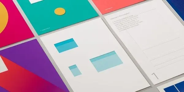
“Material Design is a visual language that synthesizes the classic principles of good design with the innovation of technology and science.”
Material.io
Many say that material design is the future, aiming to unify
https://thenextweb.com/dd/2015/11/10/what-are-the-real-merits-of-material-design/
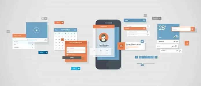
Material design isn’t just about the way Google and Android do things. It’s changing design philosophy as a whole. One popular feature of
https://www.materialui.co/colors
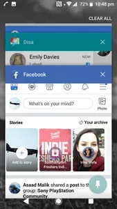
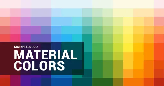
Material design is very specific about the way designers use colours. The design specifies for calmer colours. Often shades of the same colour are used together along with the card system to symbolize depth. The way designers use colours can have a large impact on the identity of a brand, as one colour will be associated with that brand. The Android platform lets designers insert their brand colour into many different places such as Google Chrome’s tabs, app headers, and on the app task view. For example, Facebook uses this on the Android platform to display their signature blue colour everywhere they can. This helps create the brand’s identity, as whenever anyone sees that colour, they will recognize Facebook.
